Morton®
Tagline + Additional Logos
INDUSTRY
Food + Drink
DISCIPLINE
Identity Design
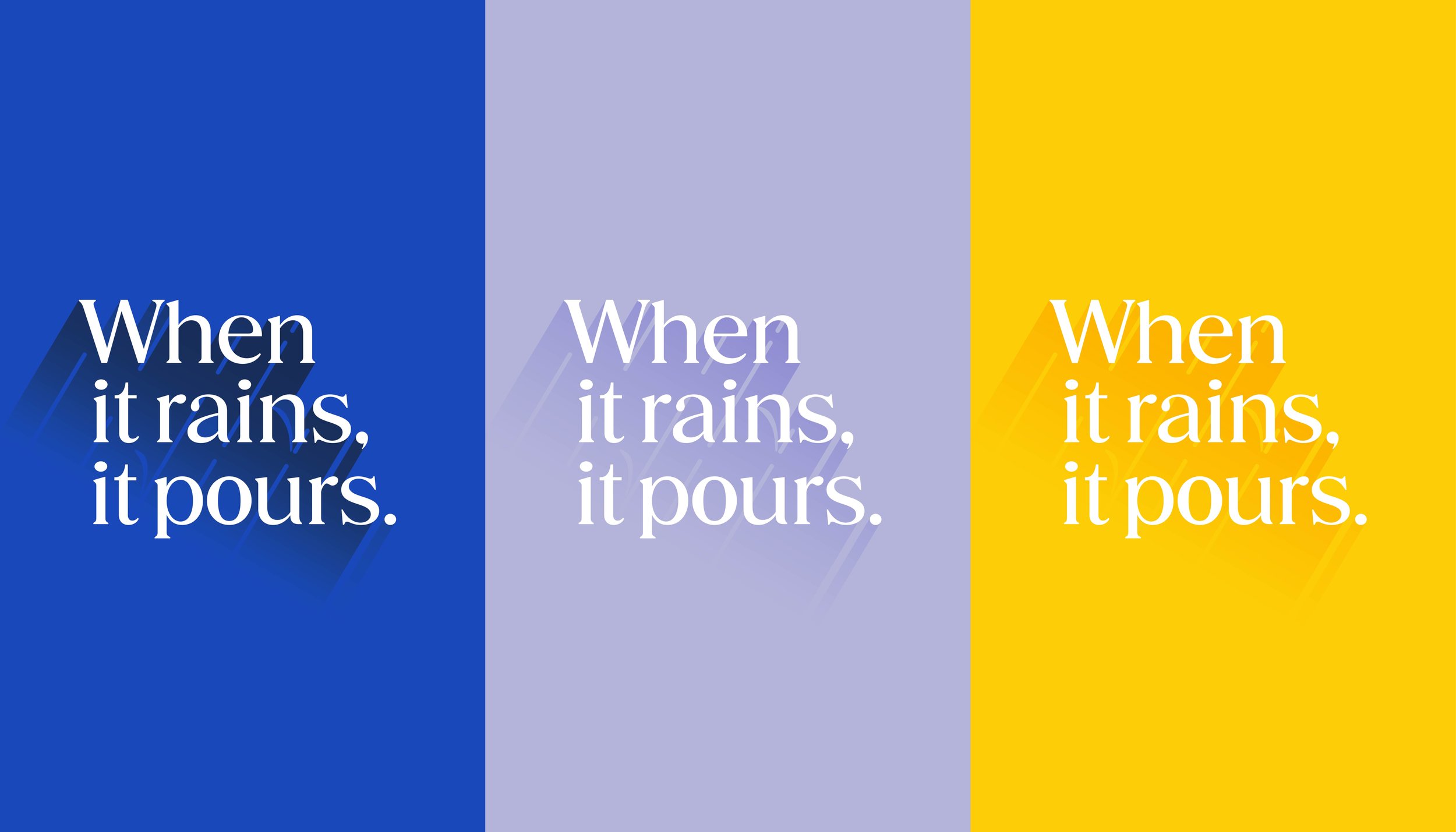
The historic Morton tagline gets reimagined
First introduced in 1914, the iconic Morton® tagline cleverly highlighted the unique free-flowing quality of its salt, becoming one of the most enduring slogans in advertising history. The new logo pays tribute to the beloved Umbrella Girl, seamlessly integrating rain at the same angle as the original Morton® logo. The foot of the “u” in “pours” mirrors the foot of the “r” in the Morton wordmark – creating a cohesive and harmonious visual link. This refreshed tagline logo stands as a bold, versatile symbol that not only honors the brand’s legacy but also reinforces Morton’s timeless strength and enduring appeal.
Two heads are always
better than one
The new Morton® Farm and Ranch logo captures the essence of the agricultural industry with modern precision. The logo cleverly combines the silhouettes of a cow and a horse, seamlessly blending them into a clean, geometric design that speaks to both tradition and forward-thinking innovation. A subtle outline of a barn frames the figures further reinforcing the agricultural theme and adding depth to the design. This thoughtful integration of imagery not only evokes the hardworking spirit of farm and ranch life but also underscores Morton®'s long-standing commitment to quality in the agriculture sector. Designed in 2024, this refreshed logo symbolizes the brand's dedication to reliability, strength and continuous innovation while paying tribute to the farmers and ranchers who have trusted Morton® products for generations.
Following in the footsteps
of the Morton family
Inspired by the philanthropic values of the Morton family, this internal logo symbolizes the Umbrella Club – a company initiative dedicated to bringing employees together through a variety of events and activities. Designed to celebrate and recognize the hard work and dedication of Morton® employees, the Umbrella Club fosters a sense of camaraderie, unity and pride within the workplace. Through team-building events, community outreach, and celebratory gatherings, the Umbrella Club reinforces the company’s commitment to employee well-being – helping to create an environment where everyone can thrive both professionally and personally.
Cultivating a work culture
built on trust and care
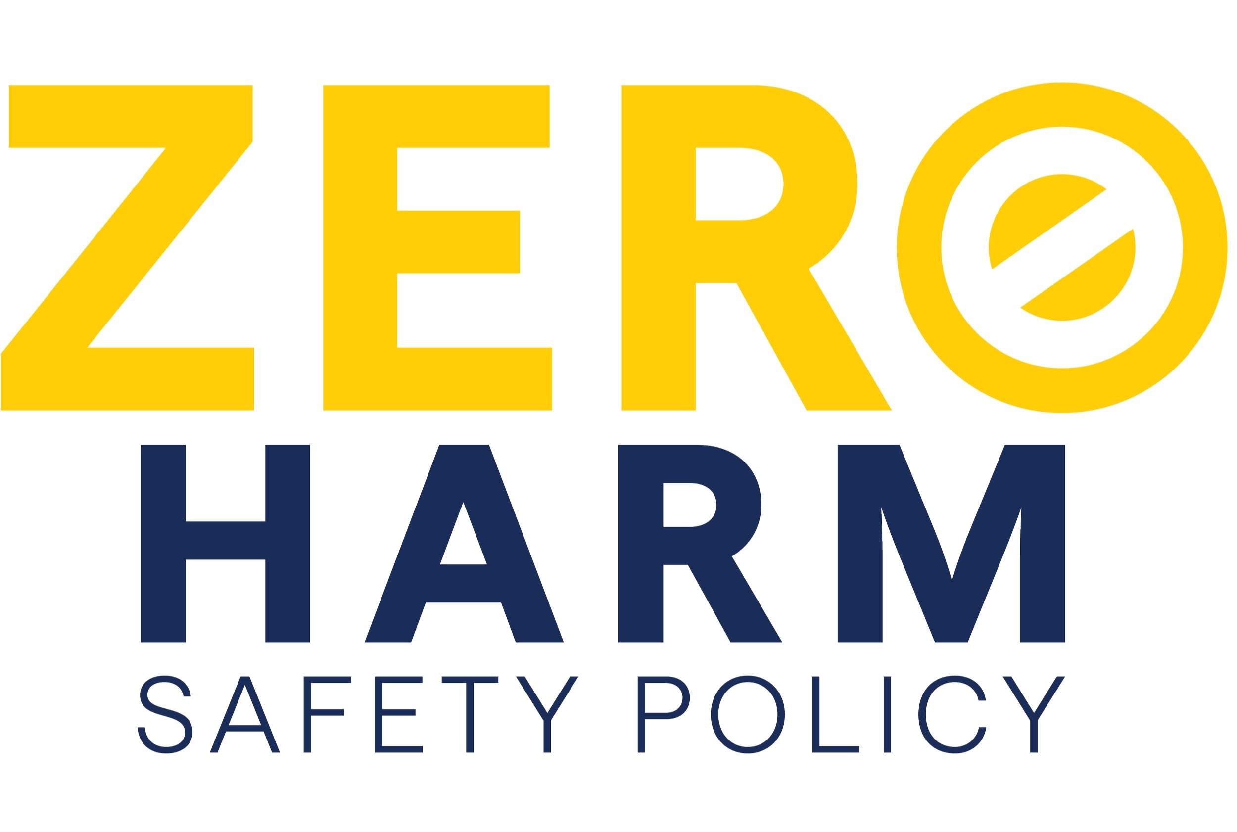
This internal logo reflects Morton’s unwavering commitment to fostering a safe and secure workplace for its employees. It symbolizes the company’s ongoing dedication to maintaining a culture of safety where the well-being of each individual is a top priority. Through this emblem, Morton reinforces its proactive approach to creating a supportive environment – empowering employees with the tools, resources, and training necessary to ensure their safety every day.
With a broad product portfolio,
Morton has the right salt for you.
The refined design and clean, crisp lines of this Morton® program logo reflect the company’s unwavering commitment to precision, quality and expertise in the salt industry. Every element of the logo has been thoughtfully crafted to convey Morton®'s dedication to delivering products that are not only reliable but also scientifically engineered to meet the highest standards. This logo encapsulates Morton®'s core belief that the right salt can make a difference – whether it’s for consumers, businesses or industries relying on precision and consistency in their products.


